
 View & download
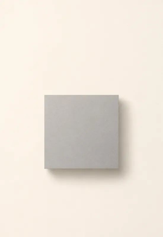
iPhone Duo Grey Square
MinimalCover 1398×2034
Inner 2670×1878
Inner 2670×1878
Monochrome is not a single palette. It ranges from true-black OLED sets to warm white plaster, silver fabric, and grey studio portraits. What connects this collection is the absence of hue: the image has to work through contrast, shape, and texture alone. Every set includes a portrait Cover and a landscape Inner file.
Last reviewed: November 18, 2026 · Released November 18, 2026 · Editorial policy
29 sets, each with a Cover and an Inner original.
View & download View & download
 View & download
 View & download
 View & download
 View & download
 View & download
 View & download
 View & download
 View & download
 View & download
 View & download
 View & download
 View & download
 View & download
 View & download
 View & download
 View & download
 View & download
 View & download
 View & download
 View & download
 View & download
 View & download
 View & download
 View & download
 View & download
 View & download
 View & download
Without colour, a wallpaper has fewer ways to hold attention. Contrast becomes the subject: a black stair against a white wall, silver foam on black sand, or a grey square floating on an off-white field. The sets in this collection are chosen because that contrast survives both the cover crop and the wider inner display.
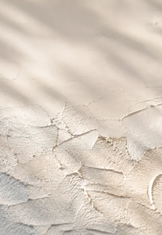
The collection is not limited to black and white. Warm whites, cool greys, and silver highlights all count as monochrome as long as the image stays within one hue family. That range is useful because a pure black-and-white image can feel harsh on a phone, while a warm grey or a soft silver can be calmer.
The cover crop needs a clear separation between the clock and the image. A white sky behind white text will disappear; a black shape behind black text will do the same. The sets here either keep the top field dark for white text or pale and even for dark text, and they place the strongest contrast below the clock.
If you use a tinted clock style, treat it like colour: check the preview against the actual wallpaper. A warm grey background can make an amber clock look muddy, while a cool silver background can make it look sharper.
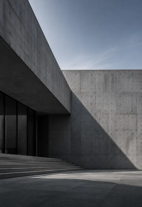
The inner display is where monochrome can feel flat if the image has only one tone. The wide files here add structure: a shadow that leads across the frame, a foam line that continues, or a fabric fold that catches the light. That gives the eye somewhere to travel without adding colour.
Widgets benefit from the same restraint. A monochrome background with a clear dark or light field keeps text legible, and it leaves the colour of your icons and widgets as the only accent on the screen. If you want a colourful home screen, this is the quietest way to frame it.
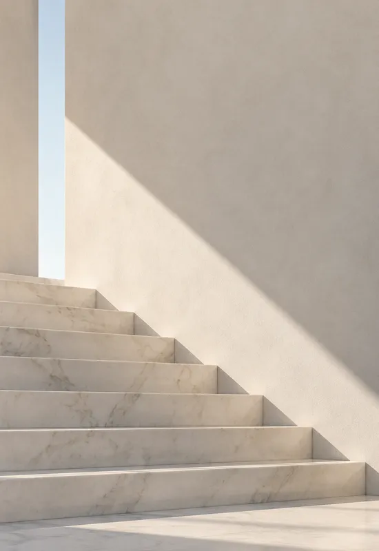
Cool monochrome sets such as Graphite Silk and Black Sand feel crisp and technical. Warm monochrome sets such as Marble Stair and Peach Terrazzo feel softer and more residential. The right choice depends on the rest of your setup: cool greys pair with blue or silver icons, while warm whites pair with cream and tan.
If you are unsure, start with a mid-grey set rather than pure black or pure white. Mid-grey is more forgiving of both clock styles and leaves more room to change your icon colour later.
One line on each set, so you can compare them before opening a page.


