
 View & download
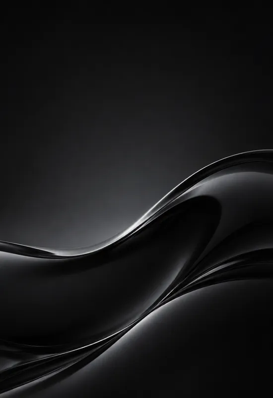
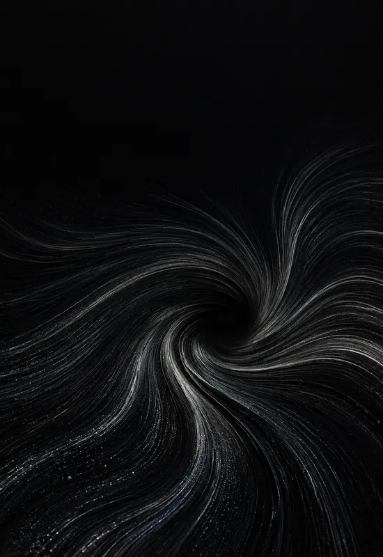
iPhone Duo Obsidian Wave
AbstractCover 1398×2034
Inner 2670×1878
Inner 2670×1878
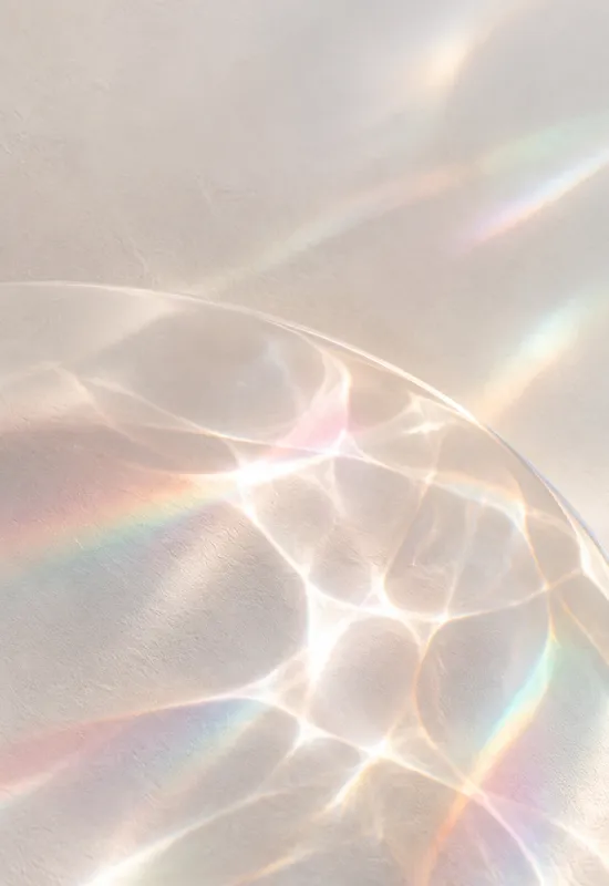
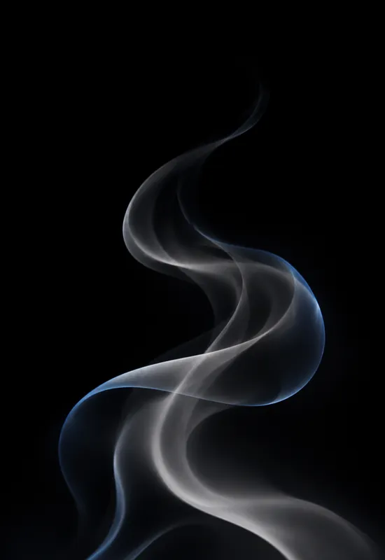
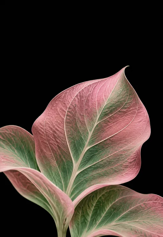
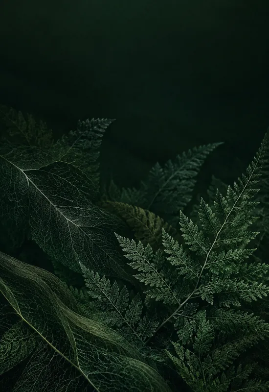
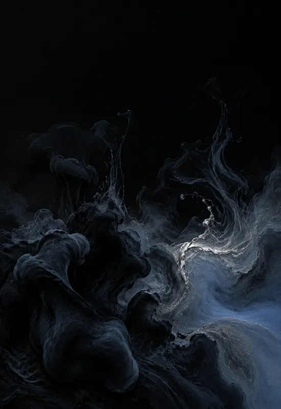
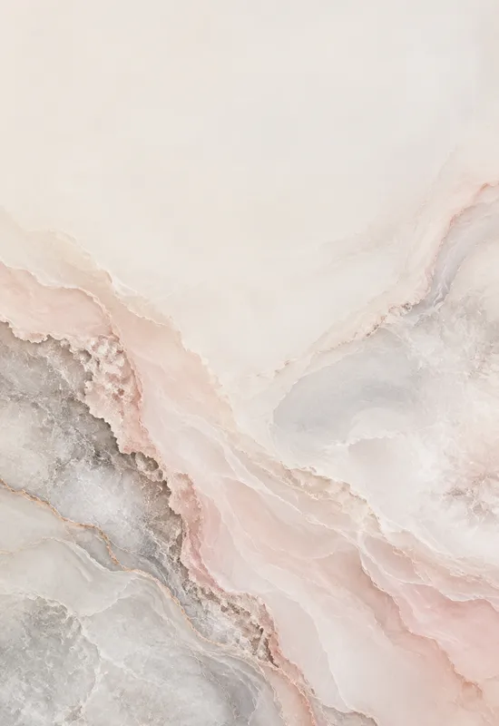
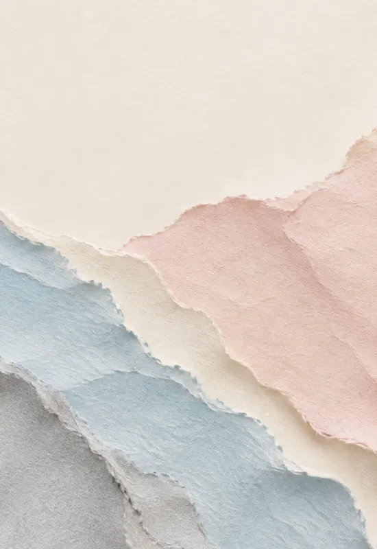
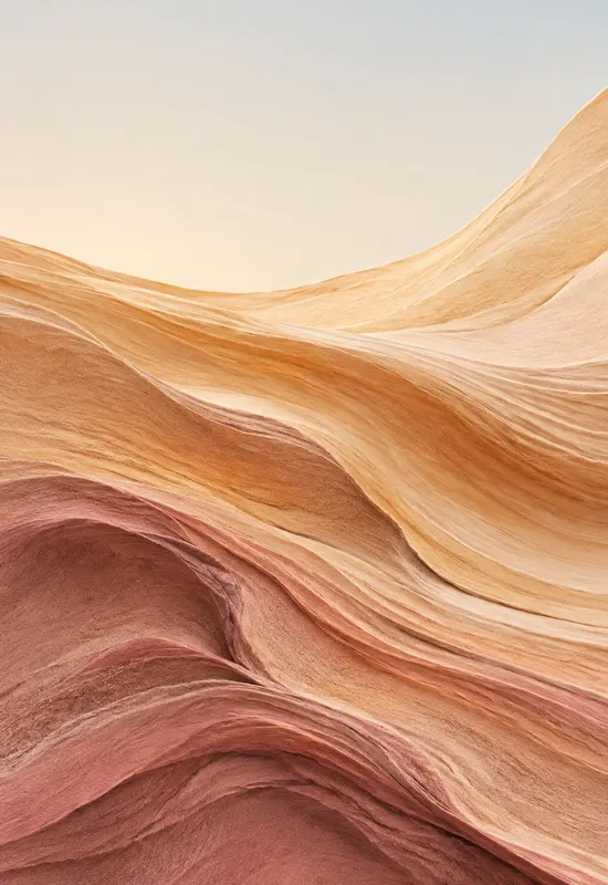
Abstract wallpapers are the least literal sets in the catalog: a wave, a caustic pattern, a glass edge, or a single filament carries the image instead of a scene. That makes them unusually good at surviving the change from the tall cover to the wide inner display, because there is no horizon or subject to lose. Every set here is one artwork exported for both screens, with the strongest form kept low on the cover for the clock.
Last reviewed: November 18, 2026 · Released November 18, 2026 · Editorial policy
22 sets, each with a Cover and an Inner original.
View & download View & download
 View & download
 View & download
 View & download
 View & download
 View & download
 View & download
 View & download
 View & download
 View & download
 View & download
 View & download
 View & download
 View & download
 View & download
 View & download
 View & download
 View & download
 View & download
 View & download
 View & download
A landscape has a horizon that has to stay level; an abstract image has a composition that can expand. When the phone opens, the form can spread sideways without revealing a missing edge or a repeated center. The sets here are built for that expansion: the cover holds one focal gesture, and the inner version lets it travel across the wider frame.
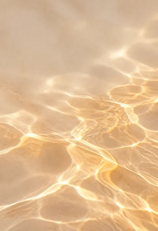
The trade-off is that abstract images can become decorative wallpaper very quickly. The strongest sets in this collection have a clear structure, whether that is the curl of Obsidian Wave, the caustic pattern of Amber Caustic, or the loop of Solar Thread. Structure is what keeps the image from feeling like a random texture.
The cover crop is where an abstract wallpaper either works or turns into noise. A bright glass edge across the middle of the screen will fight the clock; a high-contrast pattern under the camera cutout will make the phone look damaged. The sets here keep the top third quiet and place the strongest form in the lower half.
This is also why the light and dark palettes matter. A dark abstract such as Pomegranate Glass can place a deep red glow low and leave the top nearly black. A light abstract such as Amber Caustic can keep the upper stone pale and even, so dark clock text stays readable.
The inner crop is not a copy of the cover. The wide file gives the form more room and changes its relationship to the edges: a wave can curl across the display, a caustic pattern can spread into the corners, and a single line can become a long gesture. That is what makes the pair feel designed rather than resized.
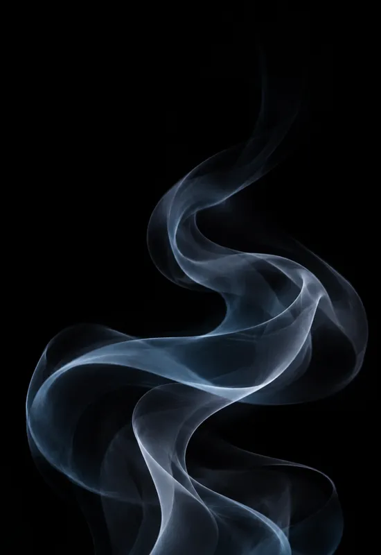
The wide versions also leave room for widgets. A strong form at one edge and a quiet field in the middle gives the interface space without hiding the artwork. If you use split-screen apps, choose a set with a low-contrast middle, such as Graphite Silk or Blue Smoke.
The three categories overlap, but they solve different problems. Minimal removes almost everything and relies on one geometric idea; texture keeps a material surface but no subject; abstract keeps a form or reflection that can be more dramatic than either. If you want the screen to disappear behind your apps, start with minimal. If you want a tactile surface, start with texture. If you want one strong visual gesture, abstract is the right shelf.
You can also mix them. A minimal lock screen and an abstract inner wallpaper can work if they share a palette. The set pages list the dominant colours, so it is easy to keep the two screens related without making them identical.
One line on each set, so you can compare them before opening a page.


