
 View & download
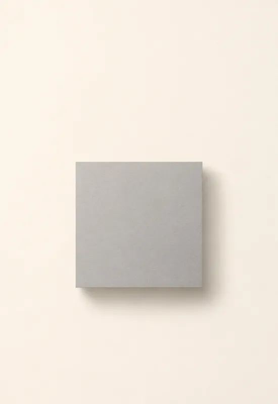
iPhone Duo Grey Square
MinimalCover 1398×2034
Inner 2670×1878
Inner 2670×1878
Minimal wallpapers are not empty wallpapers. The good ones use one deliberate shape, one line, or one quiet field to give the screen structure without competing with the clock or icons. This collection gathers the sets that keep that balance on both Duo displays, with a calm cover crop and a wide inner version that does not turn into a blank rectangle.
Last reviewed: November 12, 2026 · Released November 12, 2026 · Editorial policy
12 sets, each with a Cover and an Inner original.
View & download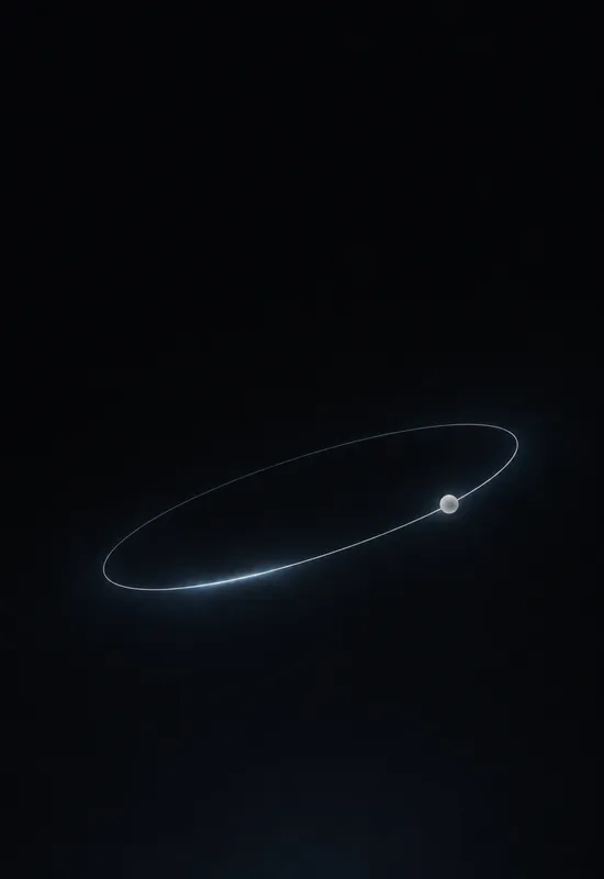 View & download
 View & download
 View & download
 View & download
 View & download
 View & download
 View & download
 View & download
 View & download
 View & download
 View & download
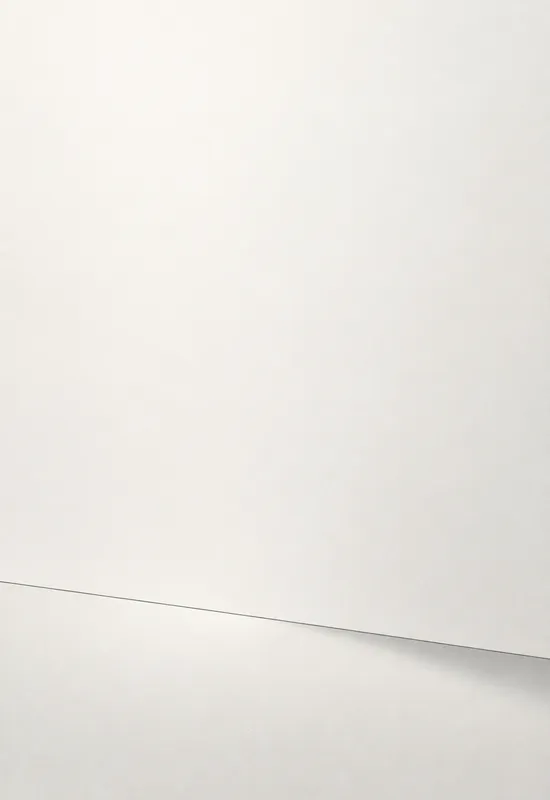
A minimal wallpaper can be light or dark; what makes it minimal is how much it leaves out. Single Line, Paper Horizon, and Quiet Grid all reduce the image to one idea, but they use different amounts of contrast. The result is a set that recedes when you open an app and still looks intentional on the lock screen.
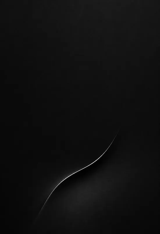
The category also includes stronger graphic gestures such as Black Arc and Orbit Line. Those sets are still minimal in structure, but the shape is meant to be noticed. That distinction matters when you choose between a wallpaper that disappears and one that gives the phone a signature.
On a minimal cover, there is nowhere for a mistake to hide. A line that crosses the clock, a bright dot under the camera cutout, or a field that is slightly too busy will be the first thing you see. The sets here keep the top of the portrait crop even and place the graphic element low, so the clock has a stable background.
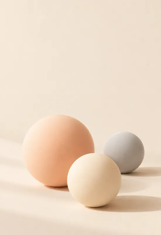
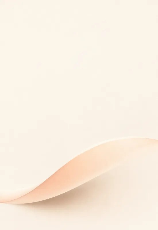
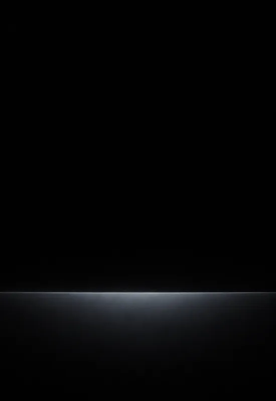
If you use a white clock style, the light minimal sets such as Paper Horizon and Warm Field rely on the system shadow. The dark sets such as Black Horizon and Orbit Line give white text a cleaner field. Check the preview with your actual clock style before committing.
A single line that works on a tall cover can look lost on the inner display. The wide versions here extend the element across the screen or leave a deliberate empty field, rather than repeating the same shape in the center. That is what keeps the inner display from feeling like an empty canvas with a logo in the middle.
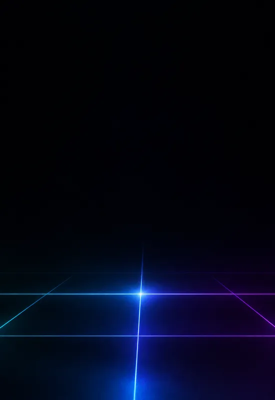
Widgets are the other test. A minimal wallpaper should leave enough quiet space for a weather block or calendar without making the screen look crowded. Sets with a low element and an open upper field, such as Quiet Grid and Soft Arc, are the easiest starting points.
If you need high contrast for accessibility, a pale field may not be the best fit. A dark set with a clean top edge will make the clock easier to read. If you use many colourful icons, a minimal background can also make the home screen feel unfinished; a texture or landscape may give the icons more context.
Minimal is a tool, not a rule. The collection is here to make the interface easier to read, not to remove personality from the phone. If a single arc or a paper horizon makes you smile every time you unlock it, it is doing its job.
One line on each set, so you can compare them before opening a page.


