
 View & download
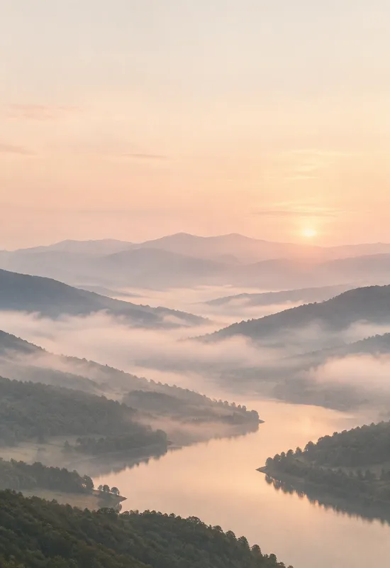
iPhone Duo Pale Dawn
LandscapesPNG · 1398×2034
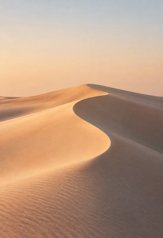
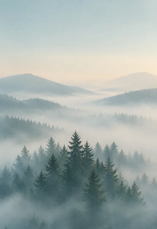
Aesthetic wallpapers are less about a single subject and more about mood: soft light, restrained palettes, and enough negative space for the clock and widgets. This collection gathers the sets that fit that brief, each delivered as a matching Cover and Inner file for the Duo’s two displays.
Last reviewed: October 28, 2026 · Editorial policy
8 sets, each with a Cover and an Inner original.
View & download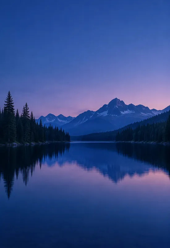 View & download
 View & download
 View & download
 View & download
 View & download
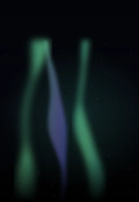 View & download
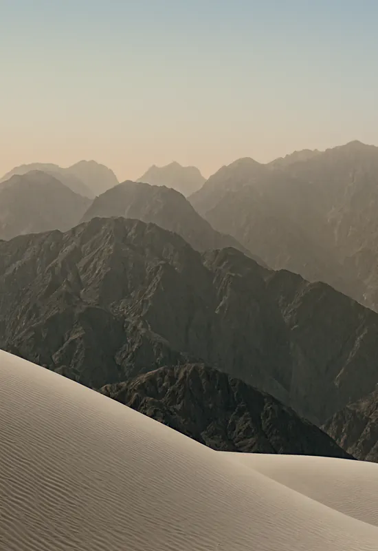 View & download
Aesthetic is a broad label, so this collection uses a narrow definition: a limited palette, soft contrast, and a clear focal point with enough negative space for the clock and widgets. The sets here are not necessarily minimal, but they are calm. They avoid busy patterns, hard edges, and high-saturation colour that would fight the interface.
The collection mixes landscapes, gradients, and abstract textures. What connects them is the way they sit behind text. A good aesthetic wallpaper should still look like something when you stop to look at it, but it should not demand attention every time you unlock the phone.
Soft light is the defining feature of this collection, and it creates a trade-off. A pale sky is pleasant in daylight, but white clock text can disappear into it. The sets here handle that in different ways: some keep the top third slightly deeper, some use a warm tint that separates white text, and some rely on the system clock shadow.
If you use a white clock style, check the preview before setting the wallpaper. If the clock blends in, switch to a dark set or choose a clock style with more contrast. The wallpaper should support the interface, not make it harder to read.
Each set is one artwork exported for two shapes. The cover crop is portrait and the inner crop is landscape, so the composition has to survive both. The sets in this collection usually keep the cover top calm and let the inner carry the wider scene. That is why the pair feels consistent when you open and close the phone.
The pairing is not a simple resize. A landscape image cropped to portrait can lose its subject; a portrait image stretched to landscape can leave empty edges. The files here are composed for their displays, and the preview on each set page shows both versions before you download.
If you need maximum contrast for accessibility, a soft image may not be the best fit. A dark, high-contrast set with a clean top edge will make the clock easier to read. If you use your phone mostly outdoors, a pale wallpaper can also wash out in bright sunlight.
The collection is a starting point, not a rule. Use the preview to judge the image on your own screen, and switch to a darker or simpler set if the interface becomes hard to read. The catalog has filters for dark, light, and AMOLED sets so you can compare.
One line on each set, so you can compare them before opening a page.


