
 View & download
iPhone Duo Ember Mesh
GradientsCover 1398×2034
Inner 2670×1878
Inner 2670×1878
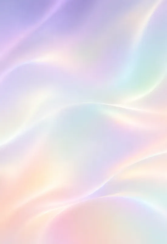
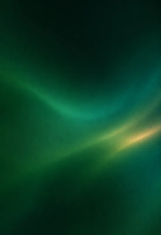
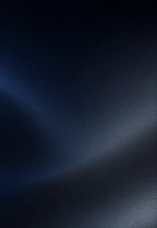
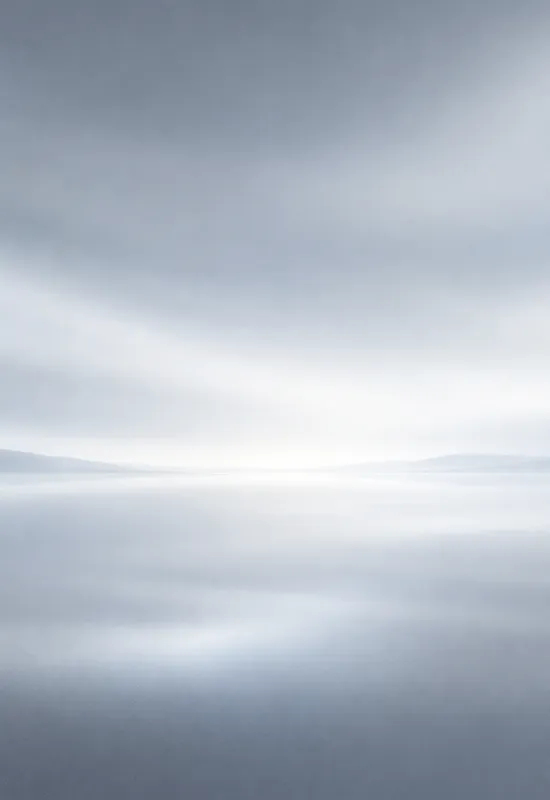
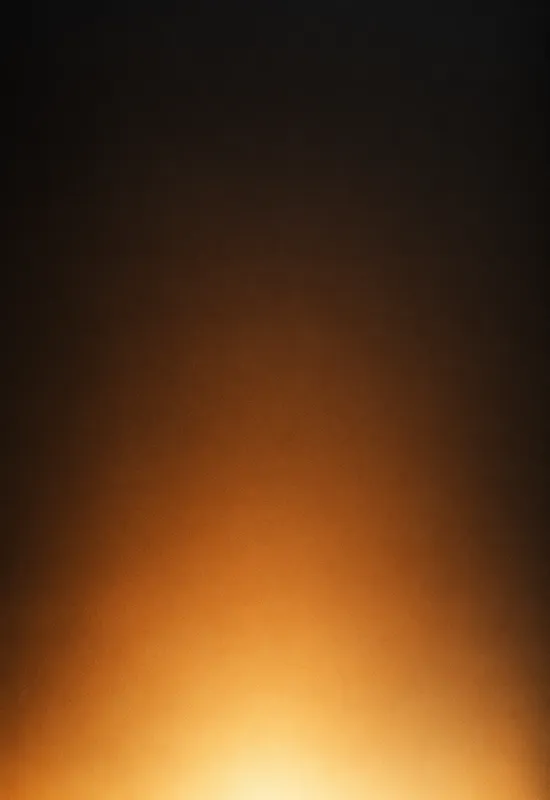
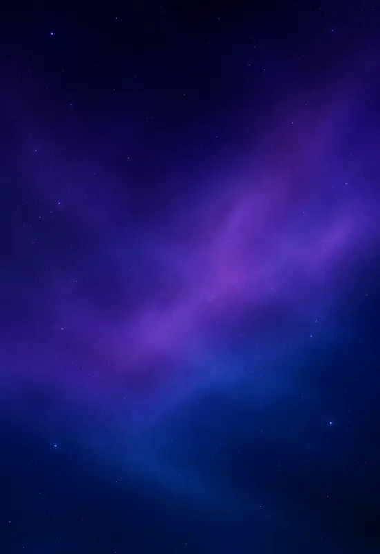
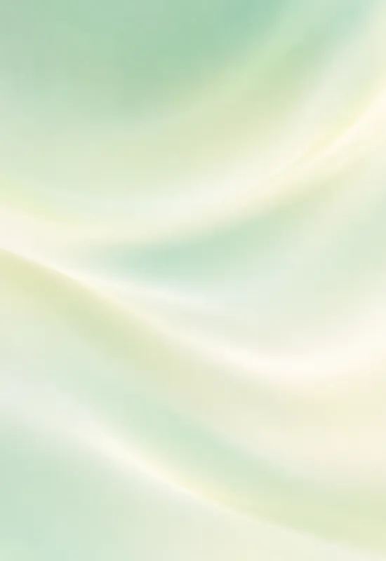
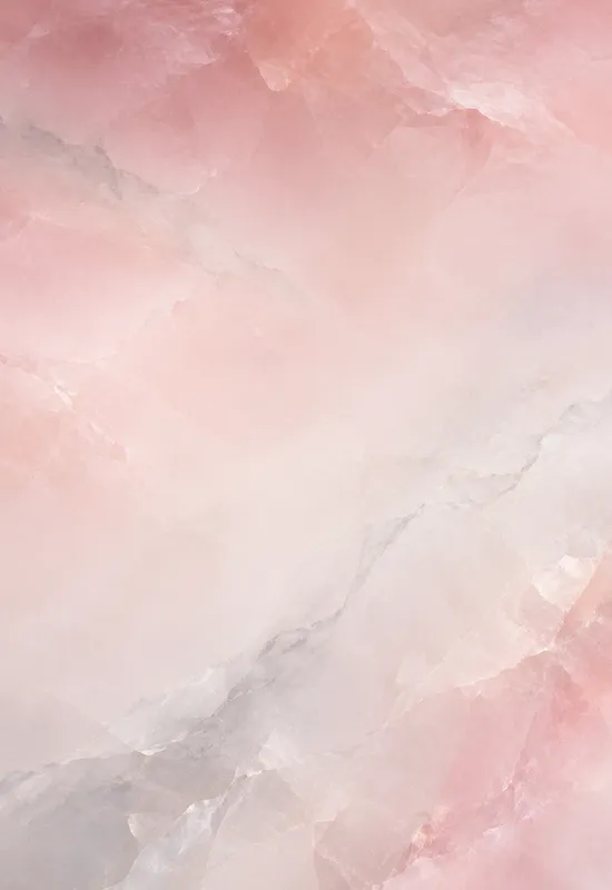
Gradient wallpapers are the quietest way to add colour to the Duo. There is no subject and no horizon, only a slow transition that sits behind the clock and widgets. Every set includes both display files, with a deeper top for legibility and a fine grain to reduce banding.
Last reviewed: October 31, 2026 · Released October 31, 2026 · Editorial policy
16 sets, each with a Cover and an Inner original.
View & download View & download
 View & download
 View & download
 View & download
 View & download
 View & download
 View & download
 View & download
 View & download
 View & download
 View & download
 View & download
 View & download
 View & download
 View & download
A gradient has no fixed subject, so it is unusually forgiving when the screen shape changes. The portrait cover can crop into one part of the colour field, and the landscape inner can show a wider slice of the same transition. There is no face, horizon, or object that can be cut off by the fold.
The sets in this collection use that freedom to keep both screens calm. The cover keeps a slightly deeper top for the clock, and the inner spreads the colour across the wider frame. The result is a pair that feels continuous without looking like a repeated wallpaper.
A large, smooth gradient is the hardest thing to show on an 8-bit display. If the colour changes too slowly, the screen can draw visible steps or bands instead of a smooth transition. The sets here add a fine grain and keep the transitions soft, which breaks up the steps without making the image look noisy.
The preview on the page is a compressed WebP file, so it can show slightly more banding than the original. If a gradient looks stepped in the preview, download the PNG and set that file instead. The original keeps more colour data and a cleaner transition.
Light gradients are warm or cool colour fields with a pale top. They give dark clock text more contrast, but white text may rely on the system shadow. Dark gradients keep the top deep and saturated, so white clock text has a stable field. Some sets sit in between, with a deep top and a warm glow at the bottom.
If you use a minimal clock style, a light gradient can look very clean. If you use a bold white clock, choose a dark gradient or a set with a deeper top third. The set page describes the top edge so you can judge before downloading.
Start with the screen you look at most. If you mostly use the cover screen, choose a gradient with a calm top and a visible colour shift lower down. If you use the inner display for reading or split-screen apps, choose a softer set with less contrast so the interface stays readable.
You can also pair a gradient with a photographic set: a soft gradient on the cover and a landscape on the inner, or the other way around. The collection notes below give one line on each set, including whether it leans warm, cool, light, or dark.
One line on each set, so you can compare them before opening a page.


